This post was in partnership with BlueStar, however all thoughts and opinions are my own.
Deciding to renovate your kitchen is a fun and rewarding experience, but it also comes with a fair share of stress. Unfortunately, only a rare project will execute as smoothly as an HGTV show.
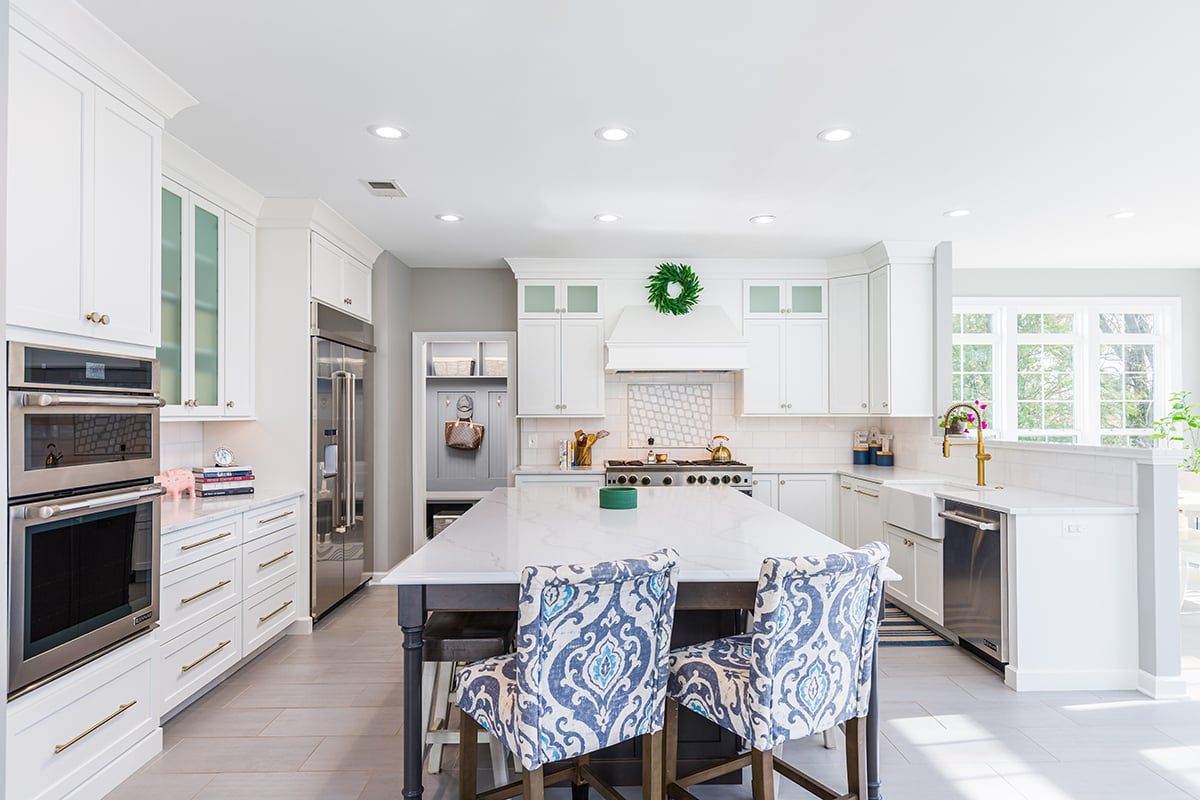
Careful consideration, planning and realistic expectations will make the extended period of time as easy as possible. I spent years curating cool ideas, which made the selection process a tad easier. As did having a realistic budget for the scale and quality I desired. In the end, which was nearly one year after, I was only left with one tinge of regret. Keep on reading to find out what it was.
From here, please enjoy a tour of my new kitchen!
The Footprint
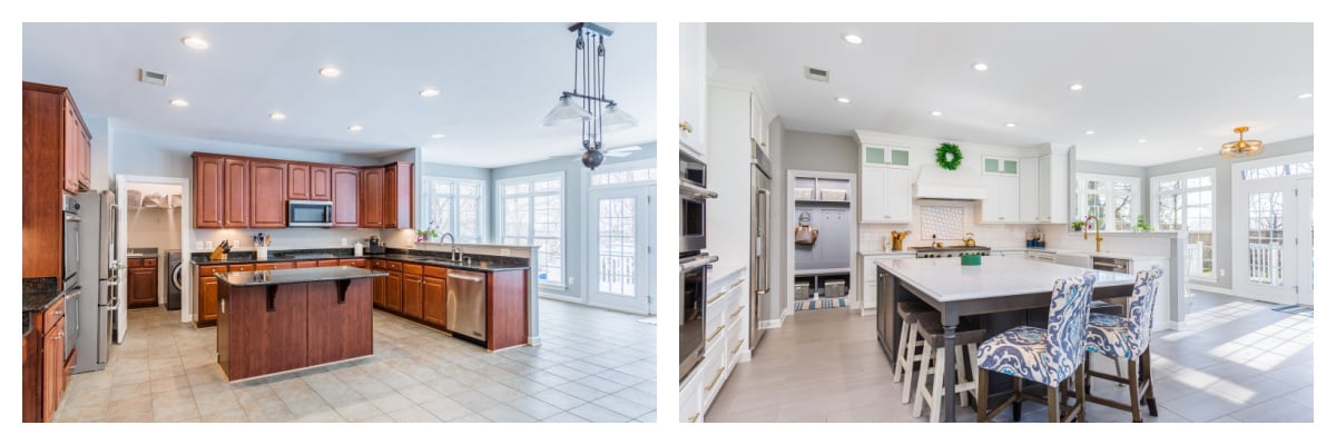
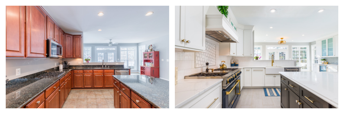
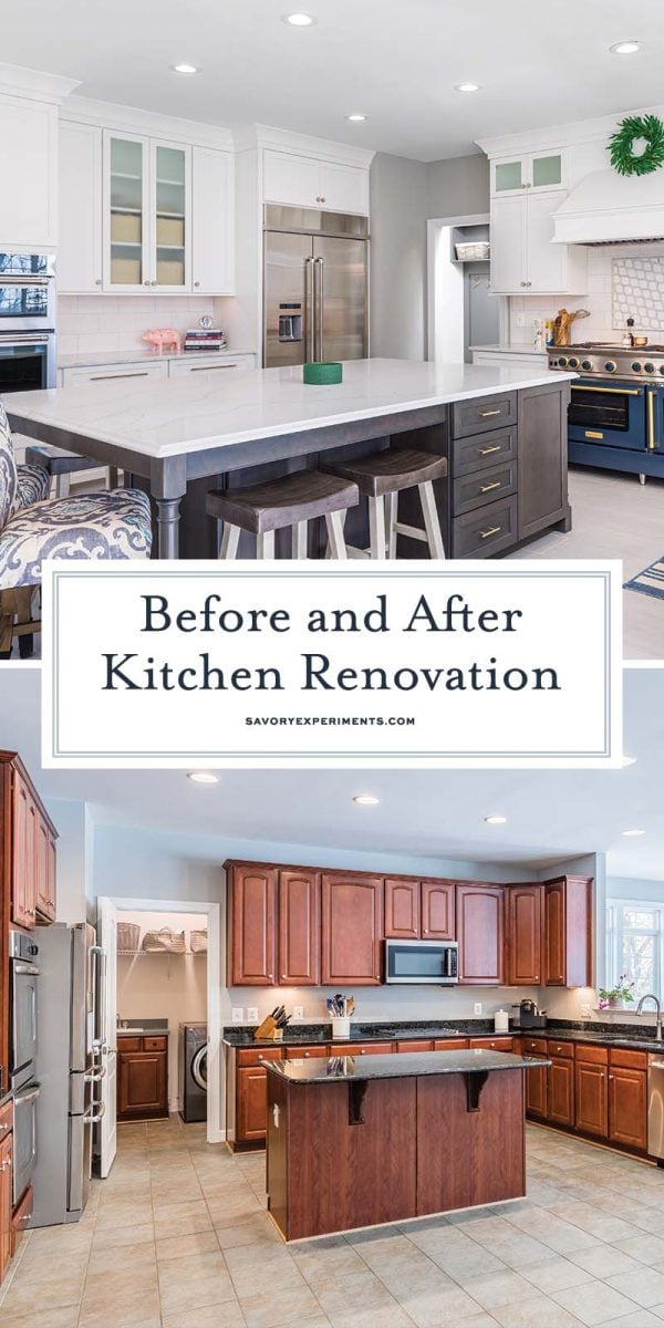
We were luckily enough to escape any major layout designs or demolition of walls, in the kitchen at least. So the basic footprint stayed the same, a U-shape with an island in the center.
The old laundry room turned into a drop zone and a sitting room in our master transitioned into more usable space as a full laundry room. This did require more drastic changes in terms of plumbing, electrical and drywall.
The Centerpiece
Have you ever seen a kitchen that just seemed like a mish mosh of items thrown together? I feel like this was a person who didn’t choose a central focal point or item. It can be a tile, sink, hardware or in my case, an appliance.
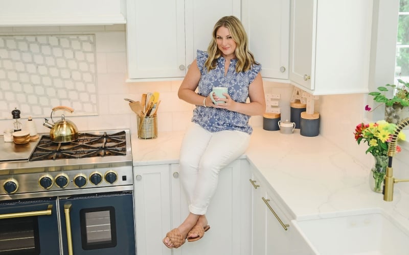
The first thing ordered and nearly the last item installed is my BlueStar range. If you aren’t familiar, Bluestar is an American based company in Pennsylvania specializing in high end, custom-built appliances, most notably, ranges. These bad boys are durably constructed using commercial grade materials that offer power and precision for home chefs.
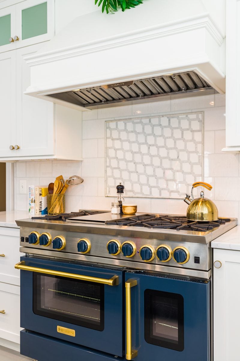
But what really sealed the deal was color selection. Not just stainless or black stainless. Not even as simple as a choice of metallic finishes. Nope, I had 1000+ colors and metals to create the ultimate eye-catching. My own truly unique piece of equipment.
Mine is a 48” range with 6 cast iron burners, a griddle, two ovens and professional broiler. I still have to pinch myself that it lives in MY kitchen. Here are some of my favorite features:
- 22,000 BTU UltraNova™ open burners, this was a the hardest adjustment, they are super powerful and took some adjusting.
- 15,000 BTU integrated griddle, the ultimate smash burger and grilled cheese maker!
- Precise 130° simmer burner, great for braising and stocks.
- Integrated wok cooking, I hadn’t had a wok in years, but I bought a new one!
- Extra-large convection oven and smaller bakers oven – fits 18″ x 26″ commercial baking sheet.
- 1850° infrared broiler, which is the same temperature that high-end steakhouses use to char their steaks.

From here, I began designing the remaining elements, always being mindful that no matter what, I wanted my eyes to settle back to the beautiful, blue stove. This also include the vent. A powerful range needs a powerful ventilation system, but again, I didn’t want anyone to look up. Bertch was able to make a simple custom hood to house a commercial grade vent that sounds like a jet engine.
Cabinets
Next to appliances, cabinetry is the next largest item and will directly compete with the top of the budget. Prices range greatly, but so do finishes, quality and the interior bells and whistles. My goal was to install as much storage in every area that we renovated, but that ended up being a lot of cabinets.
Balancing desire, budget and style ended up meaning that we used two different cabinet makers. Omega, a higher end cabinet graced the kitchen, while a more budget friendly option of Echelon was used for the mudroom, pantry and laundry room. I’m very pleased with all of them.
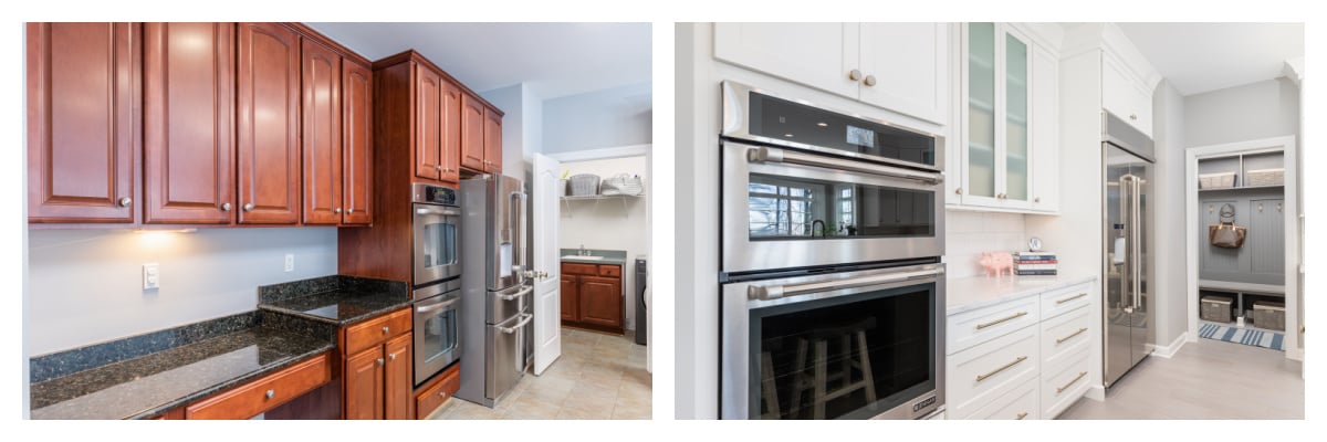
One wall previously housed a built-in desk, which we transformed into more useable counter space and storage. I also opted to extend the cabinets to the ceiling whereas they previously feel short about 8 inches.
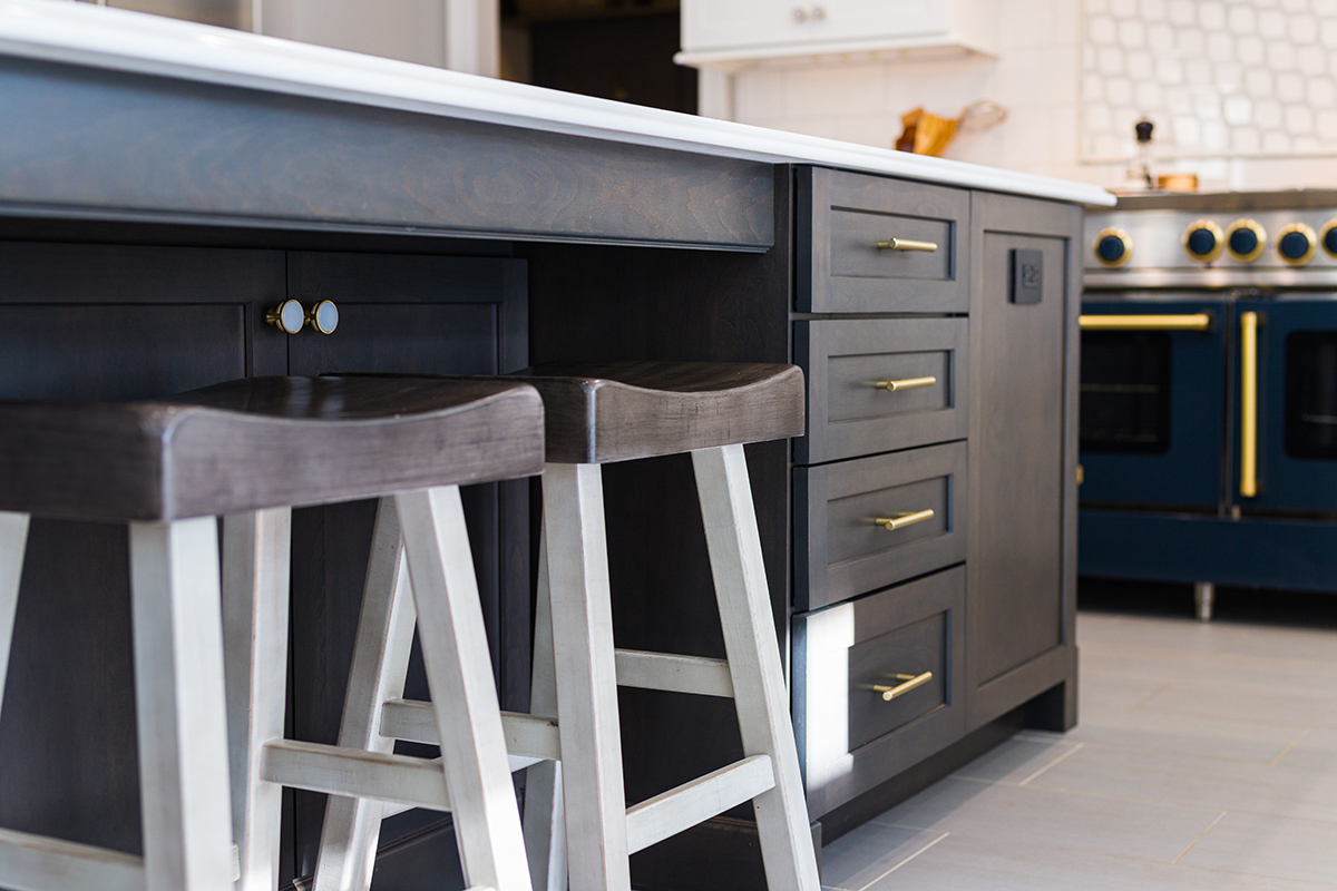
Being a kitchen set, the space is also white. It provides me with a blank canvas to spruce up with complementary colors or holiday themes. Frosted glass panels turned backwards break up the monotony without making glares and the oversized island complements the white with a dark grey stain. Staining the wood versus painting allows subtle personality shine through.
Specialty cabinets included a double stacked cutlery drawer, concealed drawers inside of larger drawers, upright dividers for storing baking sheets and cutting boards, hidden trash and recycle bins, pull out knife blocks, lemans cabinet for the blind corner and the only “must have” from hubby, a charging station drawer so all of those cords, phones and tablets stay out of sight. There are also hidden cabinets under the island.
The Sink
I know this sounds strange, but I lamented over the sink for a good long while. It was the only element I hadn’t dreamed for an embarassily long time. I knew I wanted a farmhouse style sink and I know I wanted it to be big- like large enough for my massive roasting pans and Sunday sauce kettle, but the material was still undecided.
Ceramic chips and stainless is just so blah, so I opted for Fire Clay. It is formed by using ceramic materials to form the sink and then it is covered in porcelain enamel. They are extremely durable and do not scratch as easily as other materials. The only other realistic option for my level of wear-and-tear was granite composite.
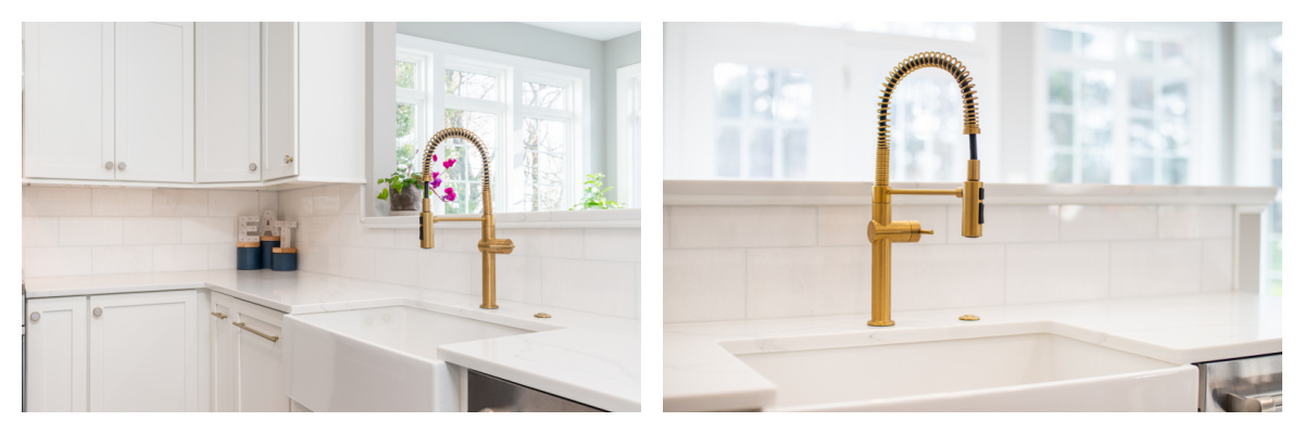
I opted for a single large basin and purchased a plastic commercial kitchen prep bucket to use as a soaking sink, should I need one.
We also went for the highest horsepower garbage disposal offered and an air button. Why in the world folks had a switch that was located several feet from the actual sink is beyond me. It is powerful (the box says it will grind a whole chicken, bones and all, but hubby won’t let me try it) and is so quiet, sometimes you don’t even know it is on.
The Beverage Center
We had one bare wall that used to be to house a lovely hutch built by my father, but my main concern was having enough storage and counter space so we created a beverage area.
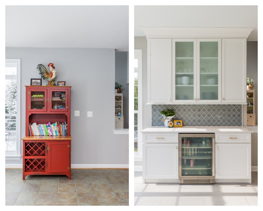
Given my profession, I fill up the fridge pretty fast, so having a dedicated space for soda, beer, wine and juices frees up precious real estate in the actual fridge. Before selecting one, check the depth of the machine to your counters and the suggested clearance behind it for venting and on the hinge and door. Ours ended up not being 100% flush with the cabinets. In the beginning, this drove me looney, but now I hardly notice.
The Hardware
Starting on this journey, I had no clue that hardware would be such a high ticket item. NO CLUE. Why wouldn’t a knob not cost a few dollars? Wrong, I was all wrong. I spent many work hours trolling the internet for sales and something that was interesting for my stark white cabinets, but not too interesting for our kitchen set. And also something that came in standard sizing because on down the road, I’ll be able to swap out the hardware if another trend comes along.
Amerock ended up being the manufacturer that offered several lines that gave me the ability to have matching pulls and knobs in the kitchen, but elevated marble finishes in the smaller areas of the pantry and mudroom. These are a little more expensive, but so pretty.
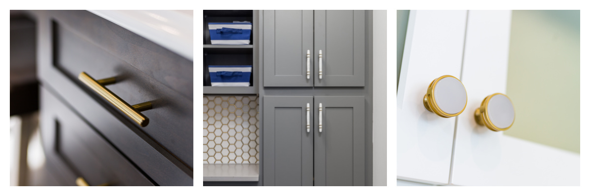
The finish is called golden champagne and was just enough to jump on the gold bandwagon without being flashy. Cabinets using the Oberon 1 3/8″ Diameter Mushroom Knob with a pearly white center, while the drawers have 12″ long pull. In the mudroom and pantry we used 2 1/2″ marble cabinet knobs and 5″ marble cabinet pulls.
The sink faucet is actually listed as “bronze” however it is clearly gold and matches the brushed gold pulls perfectly. And because I was feeling a little “extra” I also got a gold drain flange and stopper.
The Counters
If you watch enough HGTV, you know that quartz is all the rage right now. Well, quartz, also known as quartzite, is actually a man-made material, so why does it cost more than natural stone? Durability, ease of care and I wanted in! They do not require sealing and maintenance like granite, marble or butchers block and are extremely strong. If they do chip (we had two minor ones) they can come fill them, no problem!
Mine mimic the natural strations in marble with a wispy ribbon flowing through. One way to save a few dollars is to opt for your fabricator’s house-made stone. Just like other items, the ones that come with a brand name, also come with a price. And I had a lot of surfaces that needed to be covered.
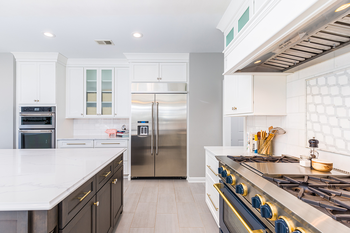
The island measurements were made by measuring the size of one complete slab so there would be no seams. We interviewed several fabricators and ultimately picked one that was a slightly more expensive, but did a better job at creating the patterns so there weren’t any visible lines or seams.
We also were able to cut corners by not cutting corners. The detail to which the edges are cut will also cost more. I did a more ornate cut on the island, but a standard cut on the rest of the counters.
Backsplashes
Because I have three very distinct places (four including the laundry room), I was able to pick a bunch of different tiles. Again, keeping the the “blank slate” concept, the majority is a white marble, which is a natural stone with each piece having its own unique characteristics. Notice that there are no outlets on any of the walls.
The only exception to the white marble is a custom inlay above the range. This was meant to bring attention to the range and highlight it. It has a rope pattern alternating grey and white with a pencil outline.
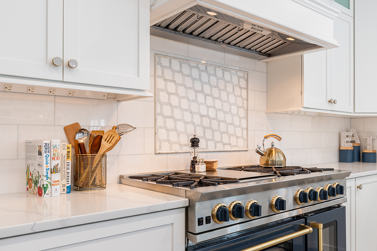
I hid them all underneath the cabinets. From these angles, you can clearly see them, but head on and in video, they disappear. Clearly marble cost a pretty penny, but not nearly as much as ornate ceramic and glass tiles.
The beverage center and pantry ended up being a spaces that I could have fun choose something more complex (and expensive). Seeing that this kitchen is also used as my set, flashy and overly trendy still wasn’t an option, but these alternating matte and glass lanterns were perfect for the main space, but this flashy gold and marble worked in the pantry.
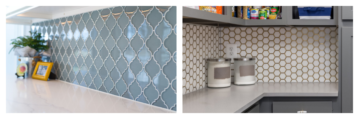
The laundry room also has a full wall of less expensive glass tiles as an alternative to paint or wallpaper.
Other Appliances
Unfortunately, BlueStar didn’t not manufacturer appliances in the other specifications that we needed, which was a 48-inch fridge and freezer unit and built-in oven and microwave. Jenn-Air was the final choice for both availability and sleek design that wouldn’t compete with the range.
The Drop Zone
Our old entry through the garage was also, unfortunately, where the majority of our guests would enter and also where my laundry room was located. Nothing says “welcome” like someone’s undies! This also meant virtually no storage, place to sort or fold any clothes. We also only had one narrow closet big enough to fit two adult size jackets so coats piled on the small counter and shoes just mountained.
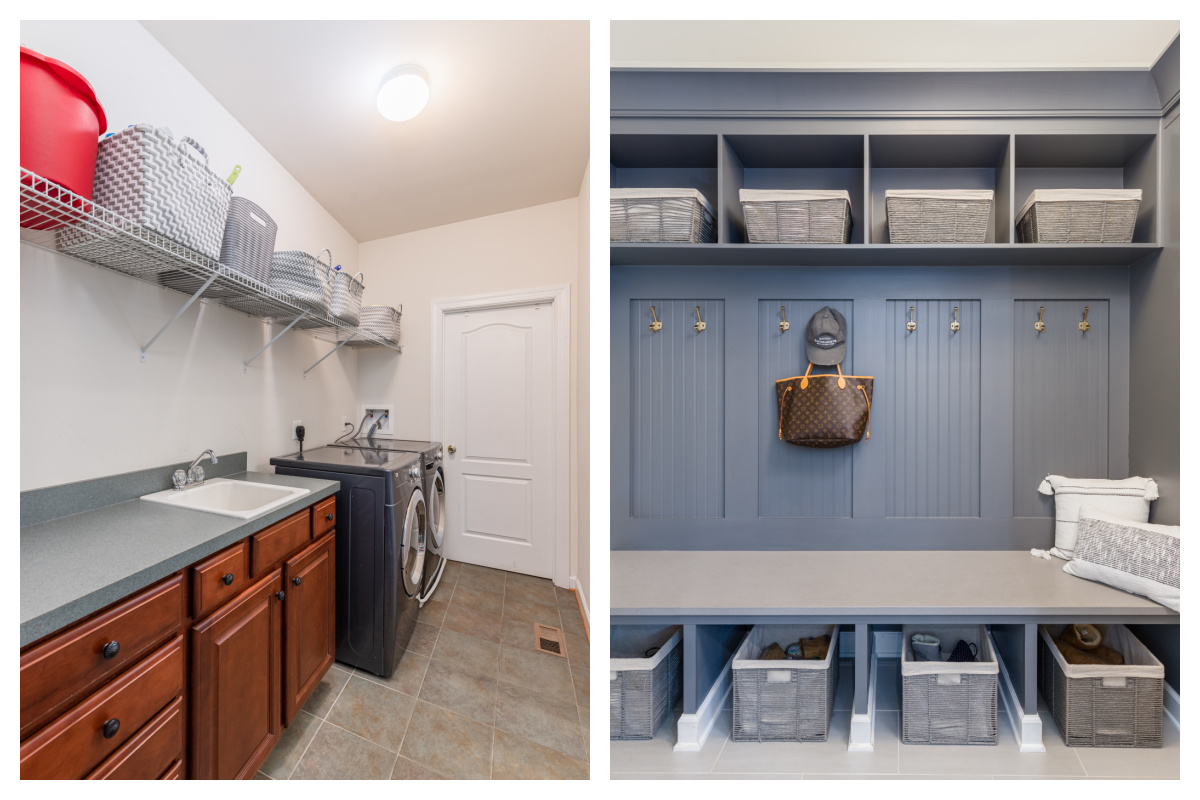
I needed a drop zone, but that also meant I needed to find a space for the laundry room. When I first pitched the idea of transforming the sitting room off the master bedroom as the laundry room, I think my husband nearly fainted, but the more it sunk in, the more we both realized it made sense.
We installed a full length cabinet for storage and a drop zone with two hooks and a upper and lower cubby for each family member. Our contractor was able to custom build the whole piece and then paint it using paint provided by the cabinet maker to get the perfect match. All I needed was baskets and we were all set!
The Laundry Room
We don’t do much “sitting” so the silly sitting room was being used as micsillouncous storage. A second floor laundry room cuts oodles of time and steps out of my day. We could also add even more storage seeing that our home doesn’t have any formal linen closets.
So there we had it, but it came at a cost. We had to drywall in a wall with a weird angle and then cut a new doorway into the hallway, which of course ended up having a drainage pipe right in the center. After this and the venting was all re-routed, we landed a spacious and functional laundry room.
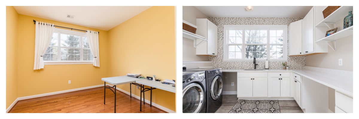
The only issue is (if you plan to move yours too) is that second floor laundry rooms are often reinforced with additional beams to secure the natural vibrations of the appliances. Since we didn’t open the whole ceiling, this was not an option and we do have some slight shaking during the spin cycle. I’d still do it again in a heartbeat, it just freaks out guests sometimes.
The Pantry
I’m pretty sure my contractor was very angry at me when I decided mid-project that instead of basic wood shelves, I wanted a butler’s pantry. But he mustered a smile and we ordered the cabinets right away and I am very pleased with the additional work space.
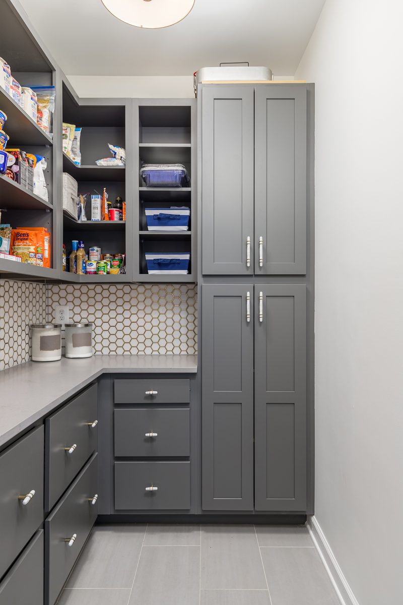
Adding counters and two new outlets allows me to use this space for small appliances like slow cookers or pressure cookers and keep them out of the main kitchen. Drawers have accessible storage. I kept the doors off so I could always have a good view of all my items. The floor to ceiling cupboard houses all of my small appliances.
The Only Regret
I said I had one regret” light fixtures. Oh, what I would have given for a set of wonderfully large and bright orbs hanging over my island, but I had to remember this was a set. And even small pendant lights would get in the way of camera angles. Instead, we added over 10 new recessed lights.
I did have fun with a little gold fan in the sunroom and then fixtures of the drop zone, pantry and laundry room.
Accent Pieces
I hadn’t thought to include links to these, but so many folks have asked, so here you go!
- Gold Tea Kettle
- Blue Canisters
- Light Up Letters
- Olive Wreath above range
- Upholstered Bar Stools
- Wood saddle stools
- White and Wood Salt and Pepper Grinders
- Salt Box
Now that I’ve shared my new kitchen, what are some things you’d love if you remodeled your kitchen?











Jessica, your kitchen is beautiful! It looks so light and bright. OMG! I love your range. 6 burners and 1,000 colors to choose from! I love the color blue you chose. And I want those upholstered barstools. They are so pretty and go so well with the rest of the kitchen. You must love being in that beautiful kitchen even more now!
I do! I love cooking, but I almost don’t want to make it messy. LOL.
Seriously such a beautiful kitchen Jessica! I love that oven/range so much, and am obsessed with your kitchen!
Thank you! I have to pinch myself every time I walk in.